


Tulum
Overview
My Roles
Re-Branding • Brand Design • brand strategy & Research • Brand Guidelines • Art Direction
Copywriting • motion Design
Though Tulum, Mexico’s current visual identity has elements that represent its culture and landscapes, it is outdated and does not truly capture the coastal town’s personality.
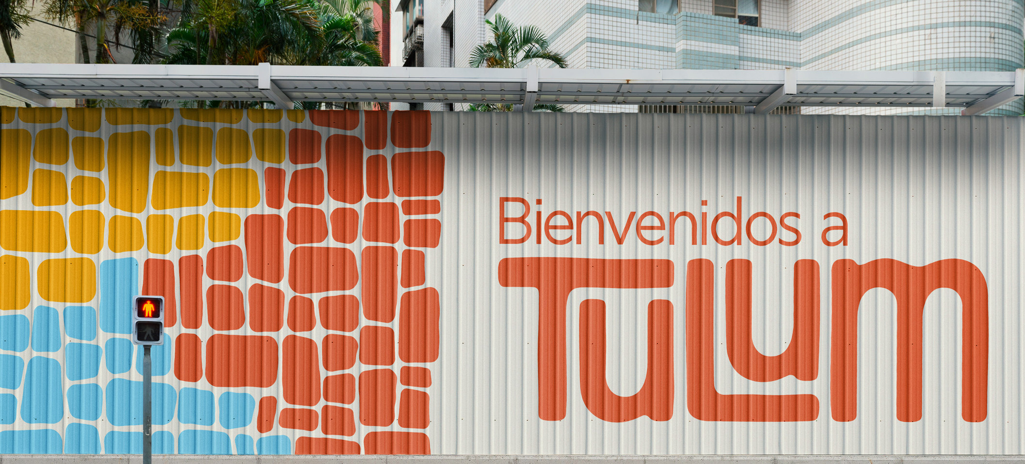
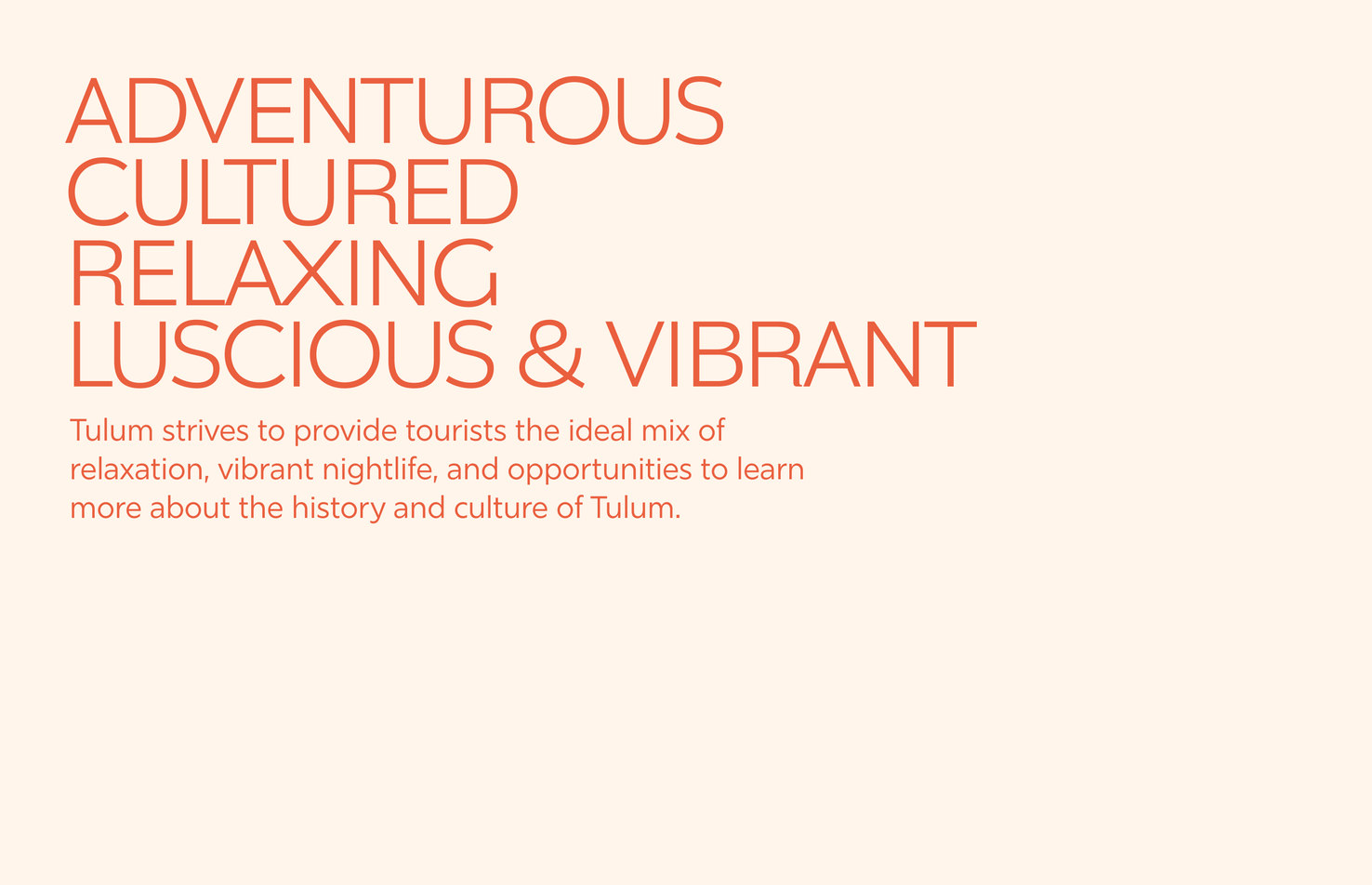
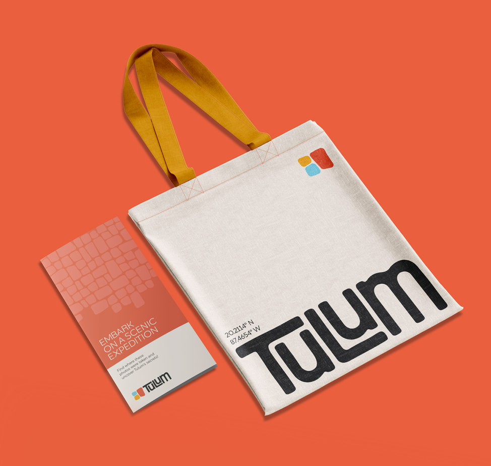
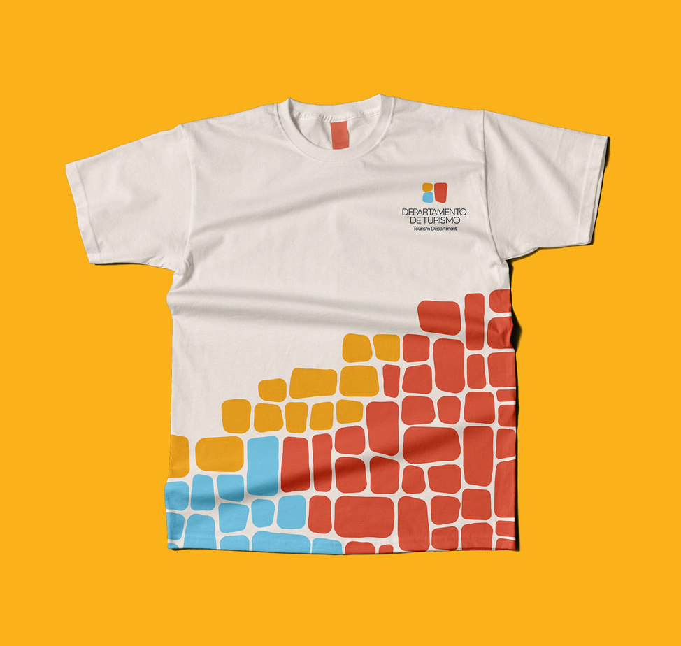
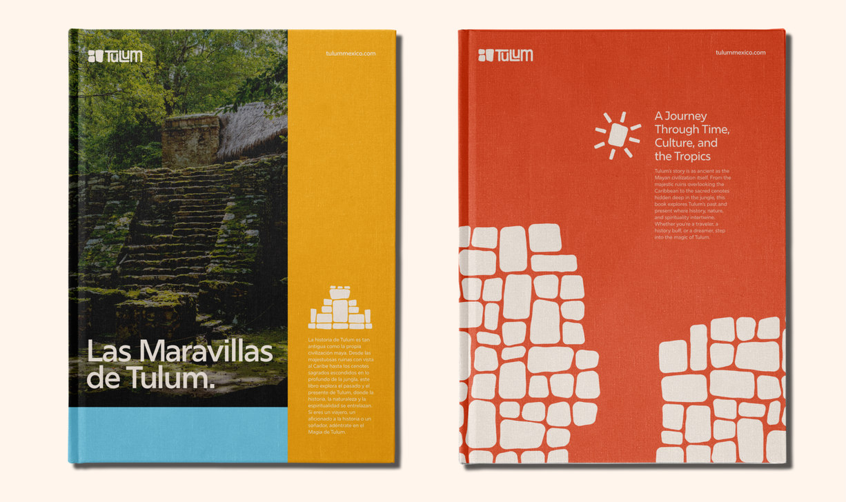
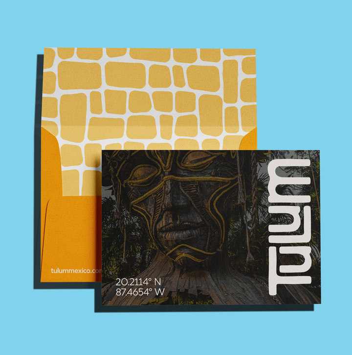
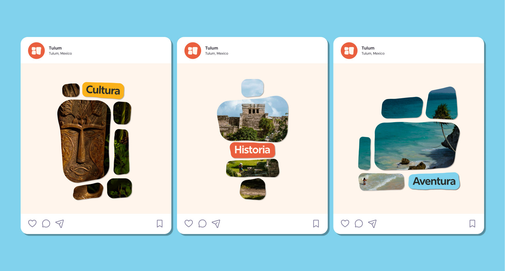
We completely reimagined Tulum, Mexico’s branding. Capturing the coastal town’s essence and embodying its vibrancy, beauty, and rich culture, while also modernizing its look to evoke a sense of trust through a new visual identity.
Contributors
Problem
Diego Moquete
Tulum, Mexico’s current branding is very dull and does not capture the history and beauty of the city’s culture.
Brand Purpose
“Always embracing our rich culture and heritage”
The logotype in this animation is being updated
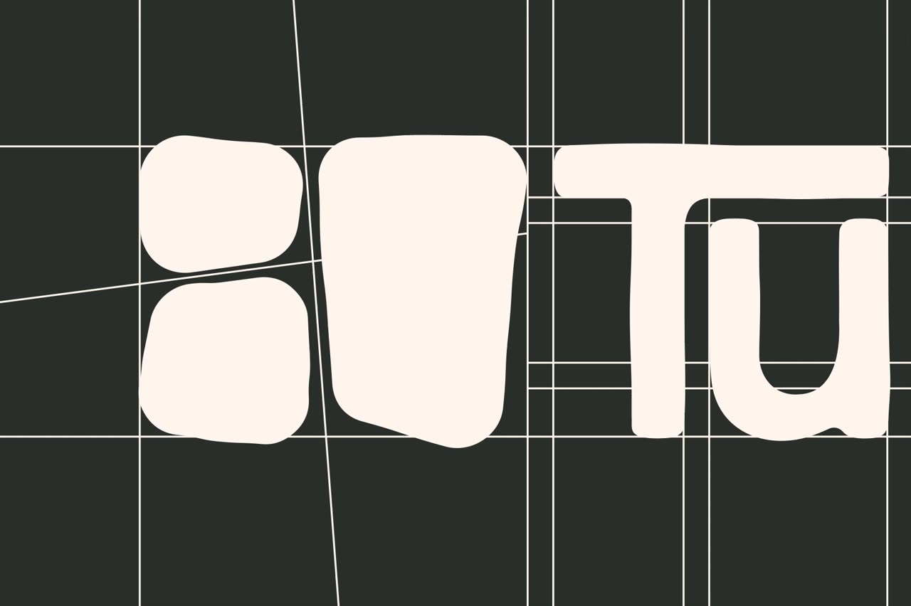
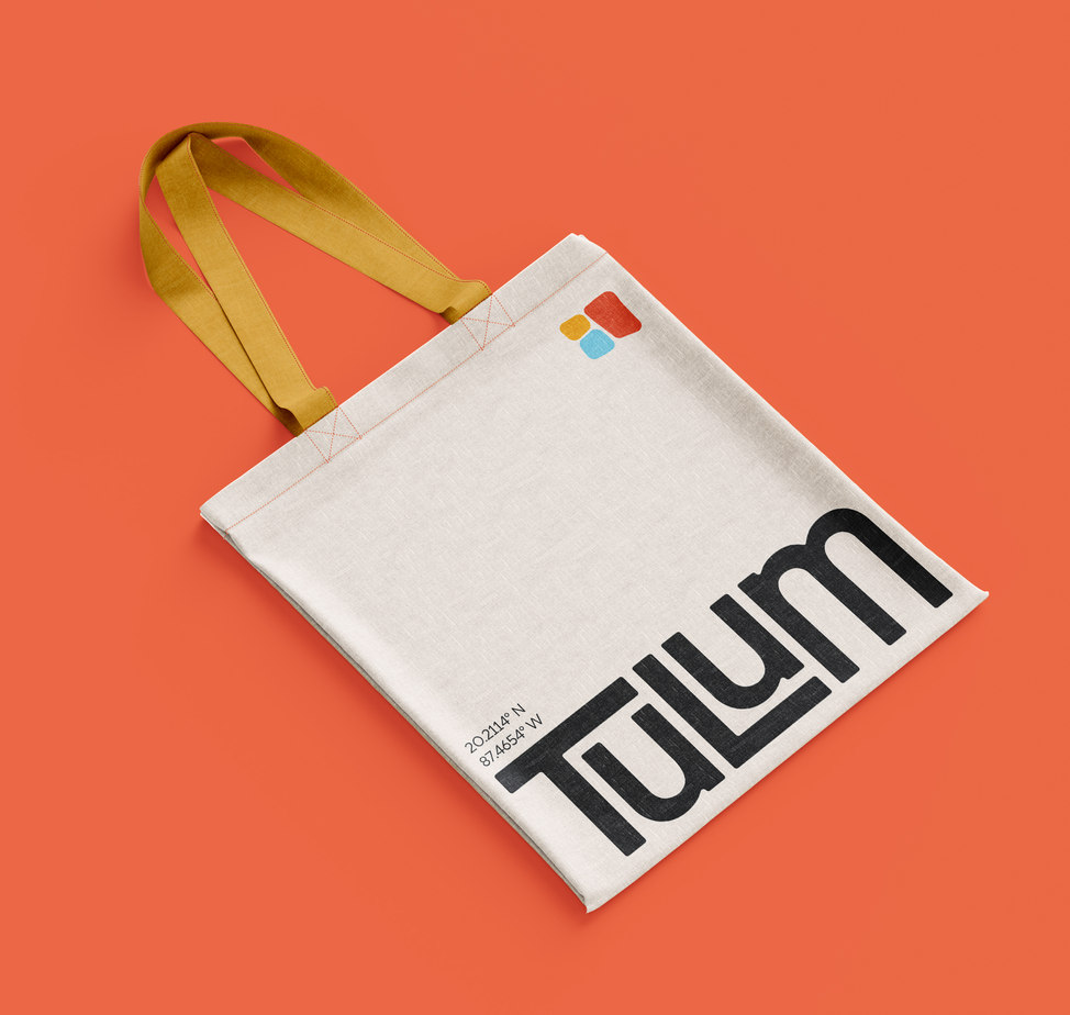
Typeface
Tulum’s primary typeface, Catalpa, aligns with the brand’s aesthetic by blending modernity and organic charm. Its clean lines and subtle curves reflect Tulum's mix of natural beauty and contemporary style. Catalpa's versatility ensures readability across mediums, creating a cohesive visual identity. Whether in print, digital, or signage, it adds sophistication and authenticity to the brand's message and design.
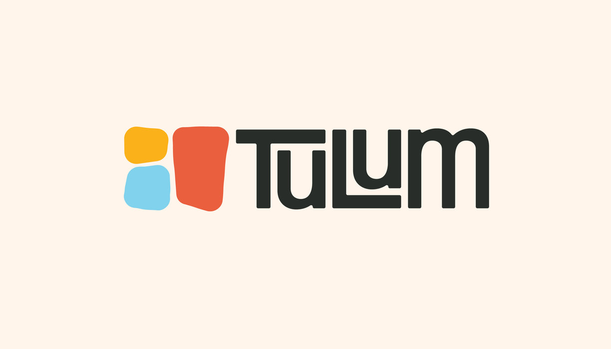
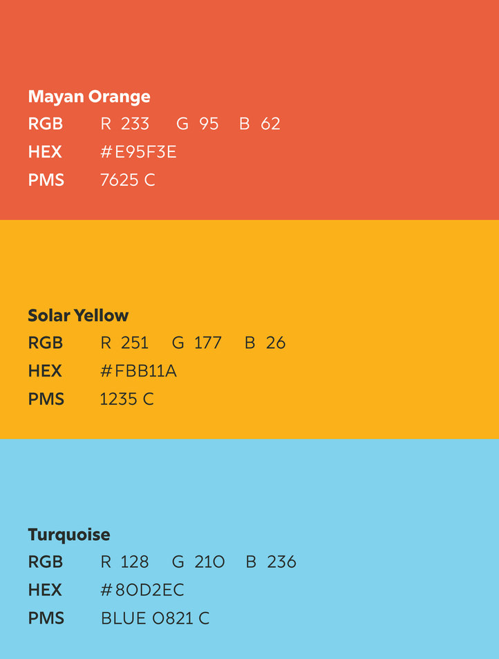
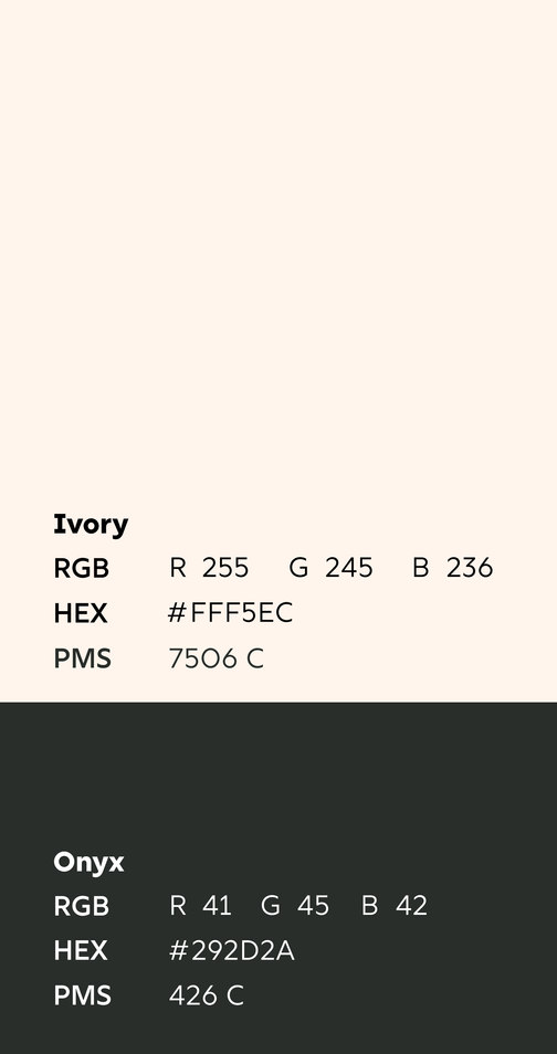
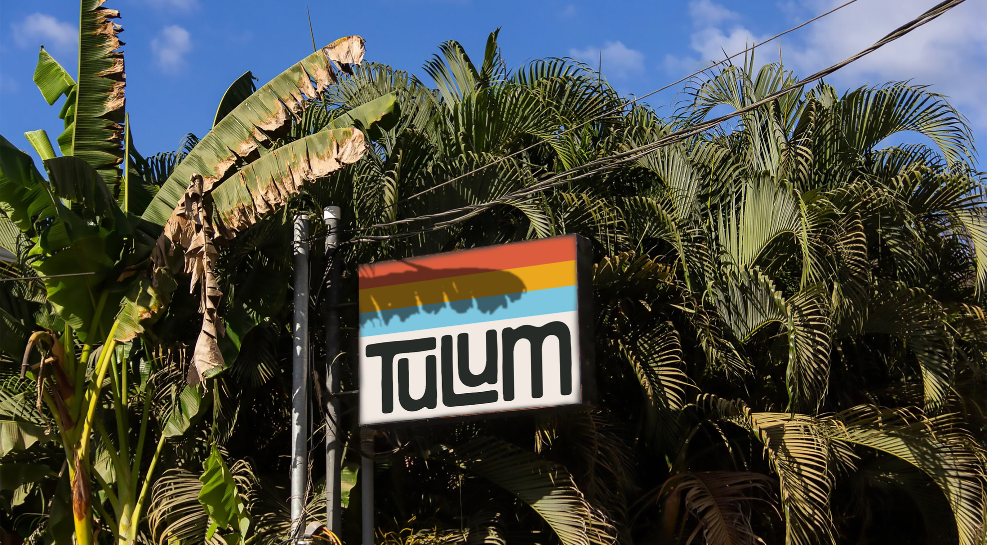
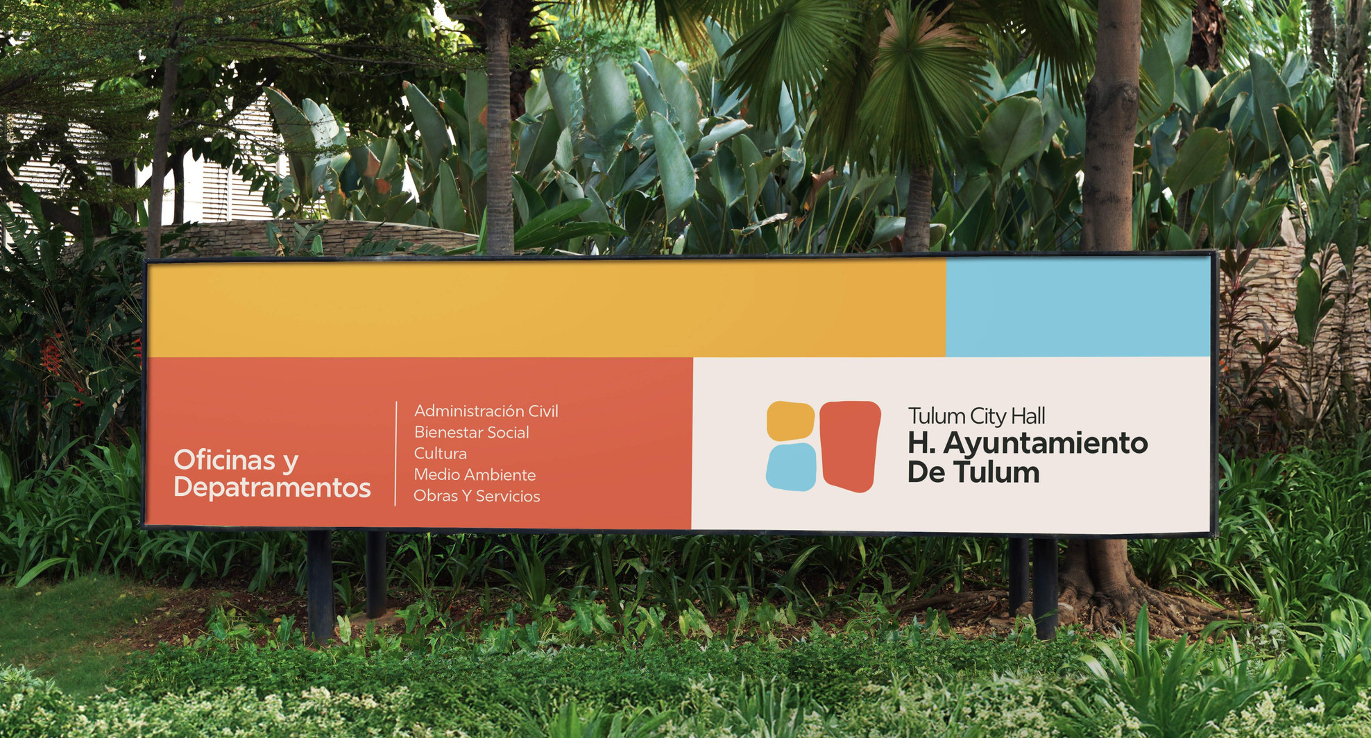
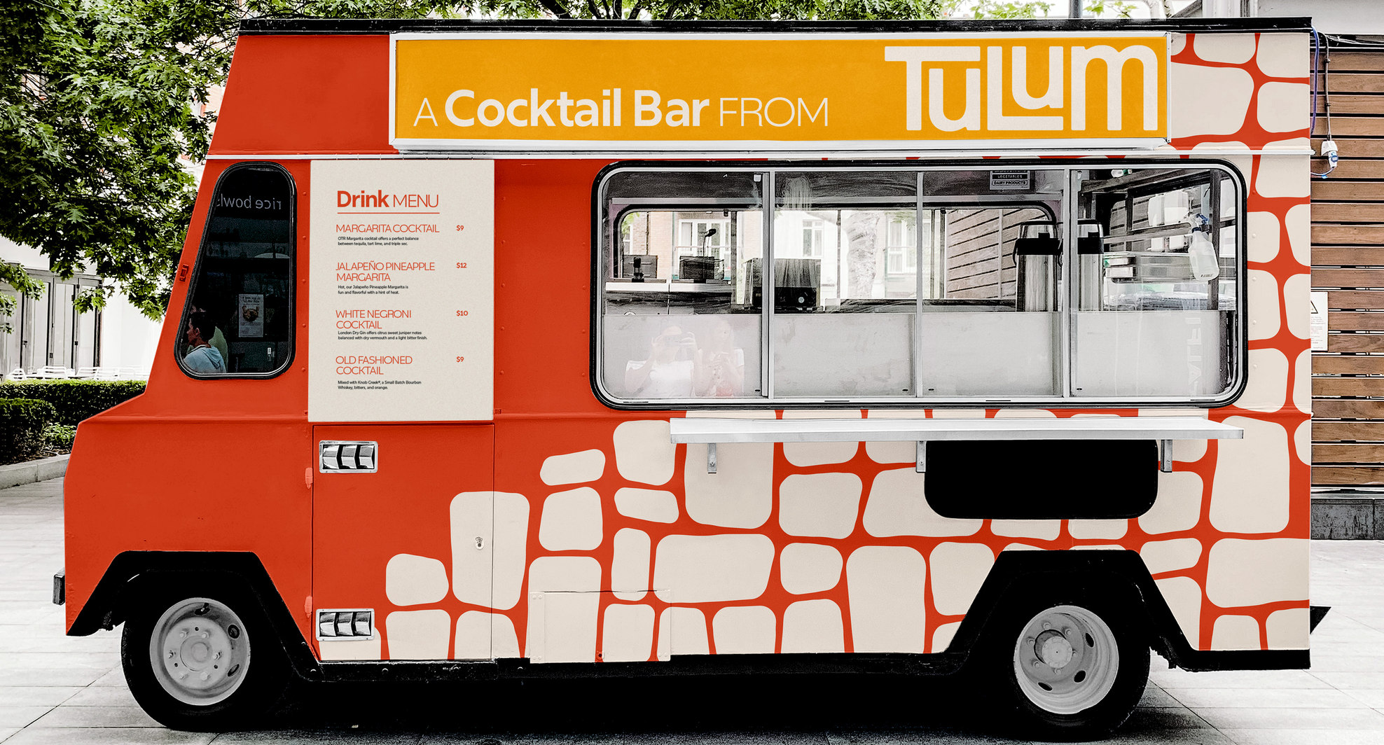
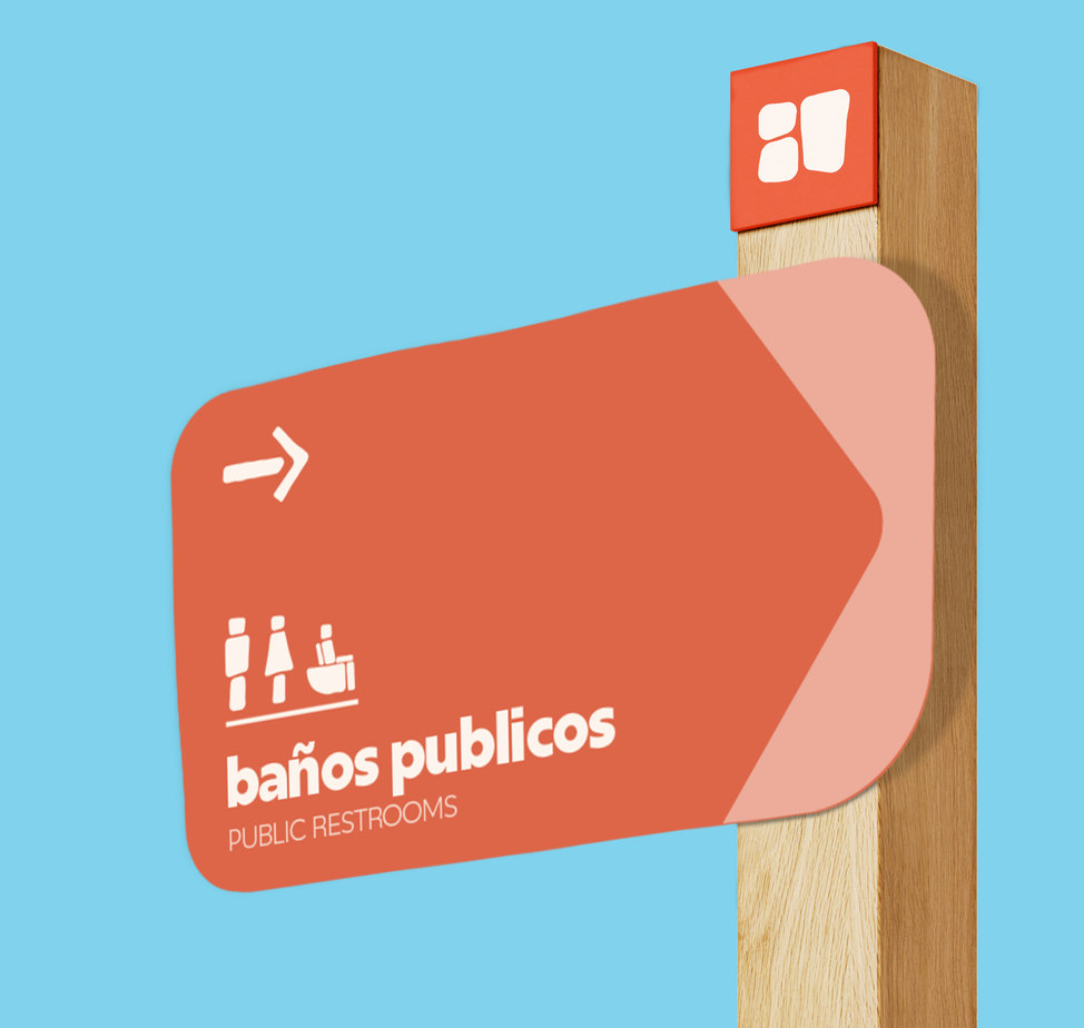
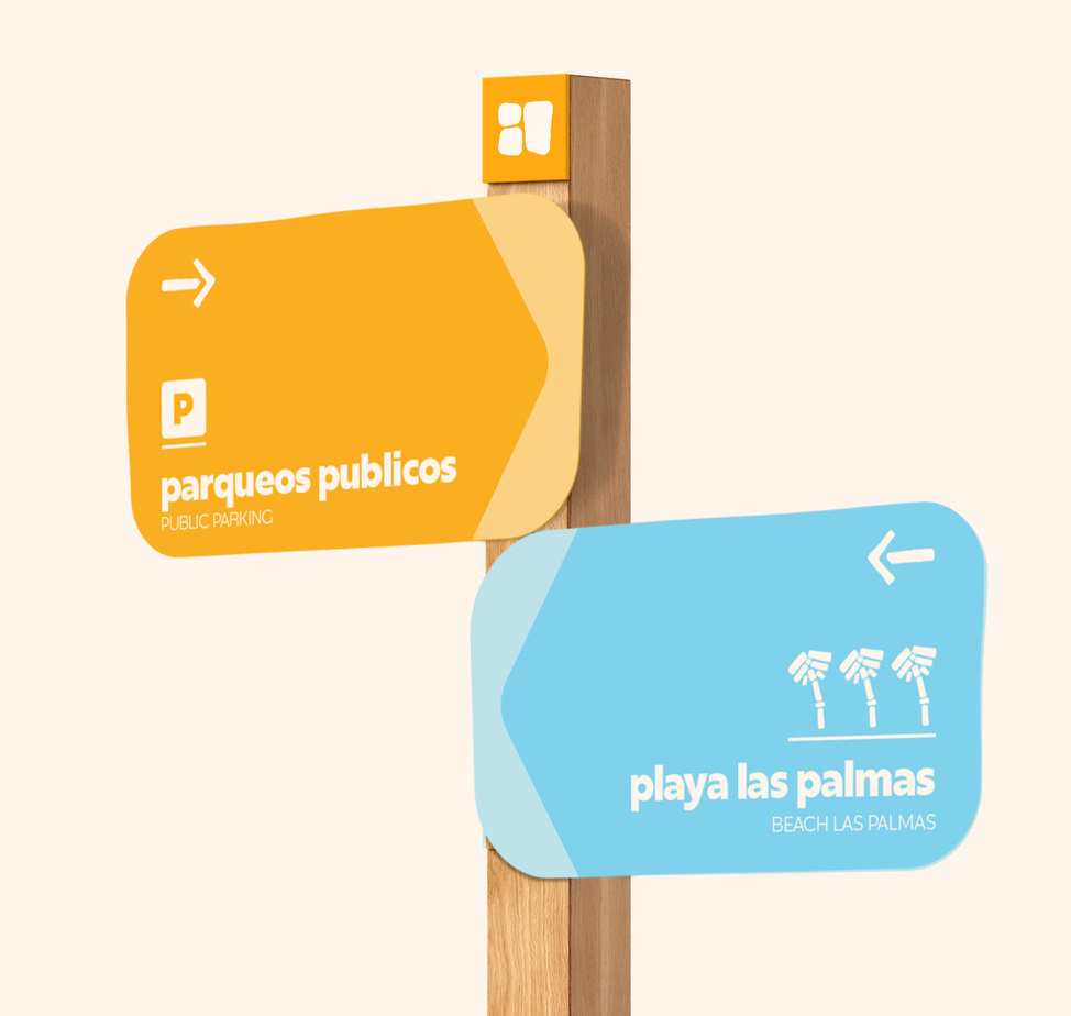
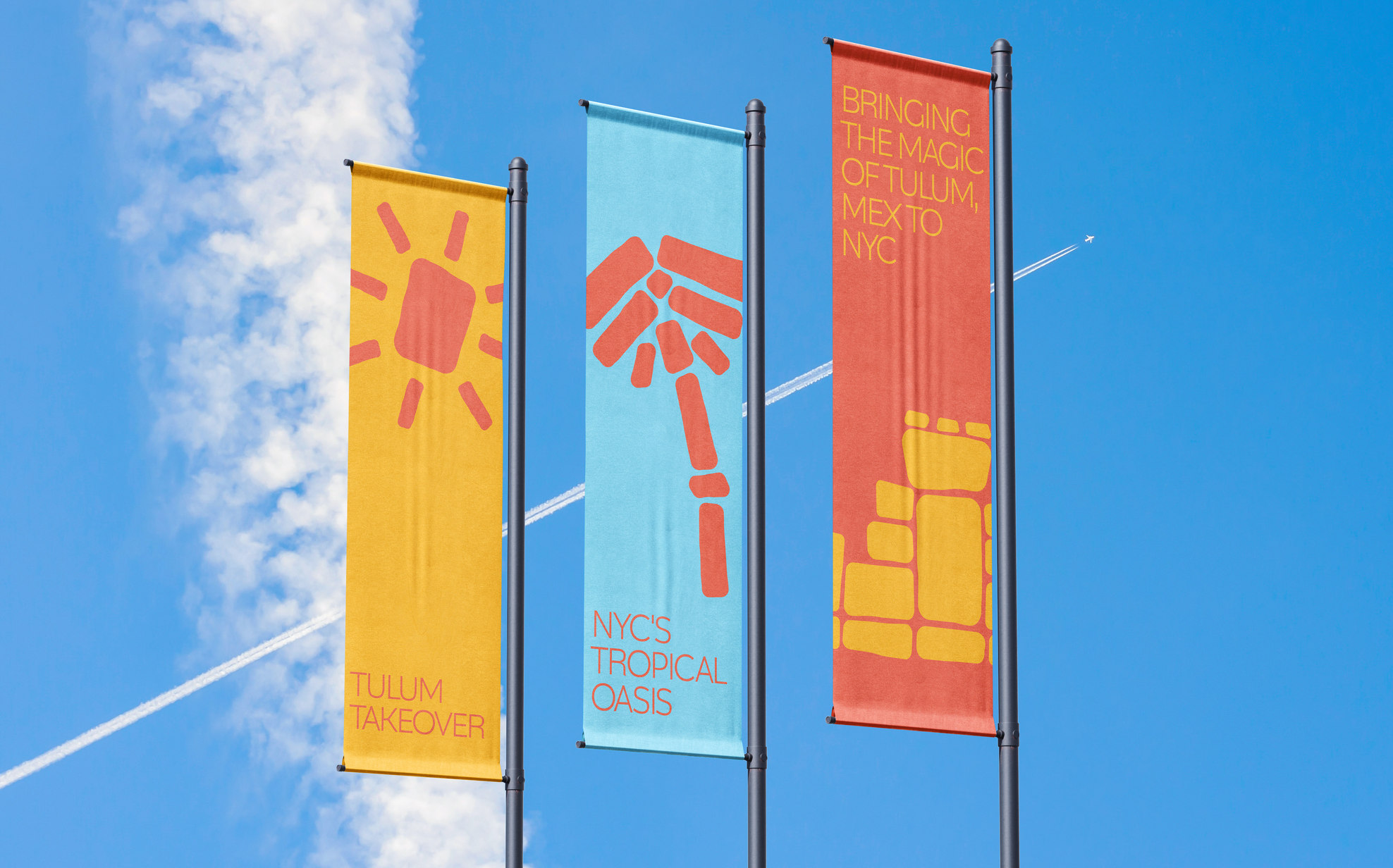
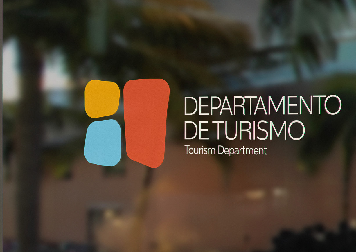
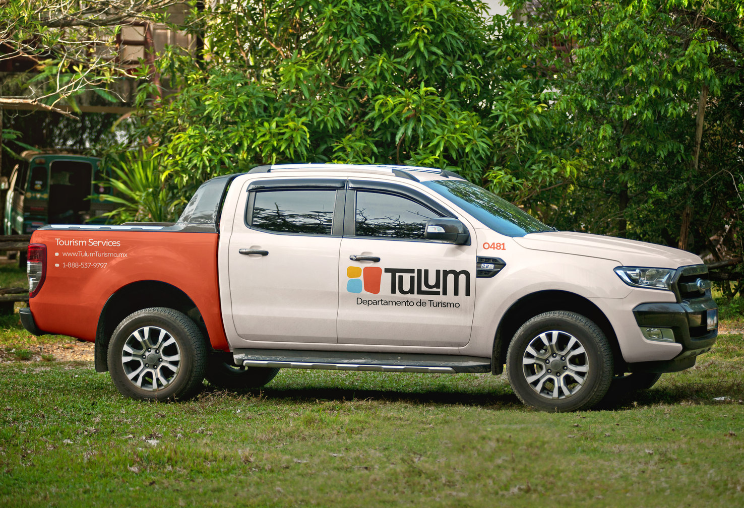
Brand Colors
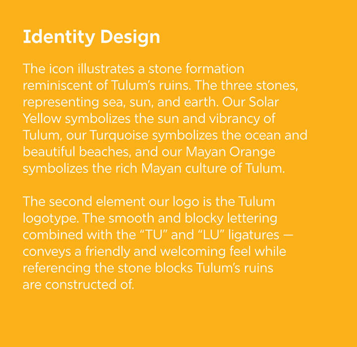
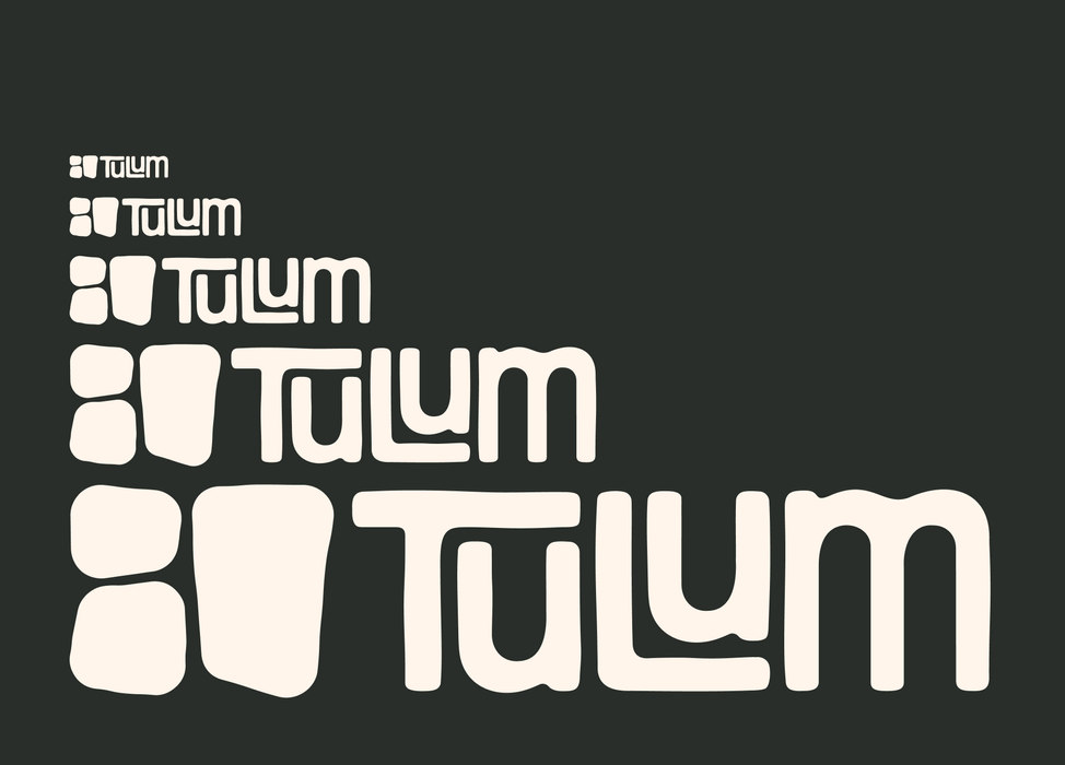
Tulum’s brand color palette is inspired by Tulum's natural beauty, featuring vibrant hues that capture its essence. Orange to highlight the Mayan culture, Turquoise reflects the Caribbean Sea, and Yellow reflects the tropical sun. Complemented by Onyx Black and Ivory Cream, the palette balances adventure with relaxed sophistication, embodying the spirit of Tulum.